
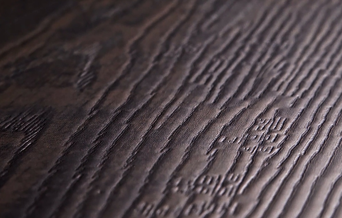
Synchronized embossing supports flooring product design by making the tactile surface correspond to the printed visual underneath it. When a wood image shows a grain ridge, pore, knot, or cut mark, aligned texture can reinforce that feature instead of placing a generic embossing pattern over it. For product developers, the value is not texture alone; it is the coordinated design language created by color, image, relief, gloss, and edge treatment.
That coordination affects how a concept is briefed, sampled, reviewed, and prepared for production. It also creates new responsibilities. A strong result requires disciplined digital files, clear texture intent, repeatable alignment, and approval criteria that go beyond a flat image. This guide explains how manufacturers, private-label teams, designers, and specifiers can evaluate synchronized embossing as part of a complete flooring development process.
What synchronized embossing means in flooring
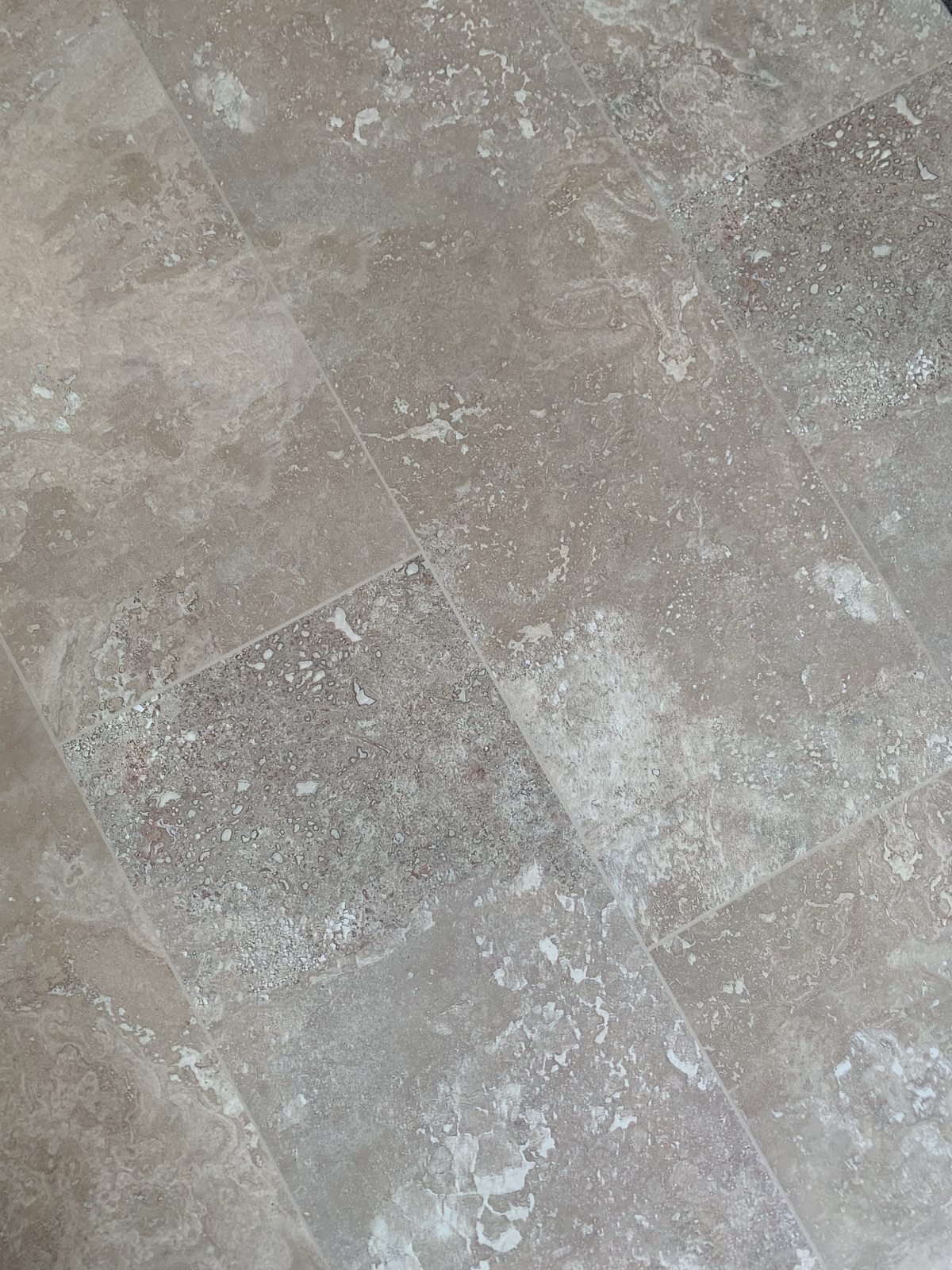
Synchronized embossing aligns a surface relief with visible features in a printed flooring design. The method differs from a generic texture that repeats independently of the artwork. Alignment allows a visual line and a tactile line to support the same grain direction, pore, joint, or material feature.
Benchwick describes its DSE, or Digital Synchronized Effect, as a digital synchronized embossing technology that combines positive and negative print detail to create three-dimensional texture. Its official innovation page states that ridges and valleys are aligned with the visible design and that the approach can be used across wood, stone, and custom patterns. Those statements provide the factual basis for the design discussion in this article.
Start product design with a texture brief
A texture brief should explain what the surface is intended to communicate. A calm oak concept may need long, subtle grain movement and restrained pore emphasis. A rustic concept may require deeper visual contrast around knots and saw marks. A stone concept may use relief to support veining, clefts, or grout details. The brief should identify which visual features deserve tactile emphasis and which should remain quiet.
Define viewing distance and use context as well. A residential plank examined at close range may benefit from small details, while a large commercial installation may rely more on broad grain direction and consistent surface balance. The development team should agree on whether realism, cleanability, visual drama, or a specific material reference has priority before texture work begins.
Coordinate the digital image and relief map
The printed artwork and texture information must be designed as related layers. A relief map should identify height, depth, transition softness, and feature boundaries in a form the manufacturing workflow can interpret. When the two layers are created separately without a shared reference, the surface may emphasize the wrong grain line or place a depression beside the printed feature it is meant to support.
Use consistent dimensions, orientation, crop, and registration marks across files. Maintain version control so the texture map cannot be paired with an outdated color image. For every revision, record what changed and why. This is especially important when several colorways share a structure but require different visual emphasis.
Design for alignment at plank scale
A screen preview can make alignment look perfect while hiding issues that become visible across full planks. Product teams should review the relationship between texture and artwork at actual scale. Important areas include long grain lines, knots near plank edges, repeating features, transitions between quiet and active zones, and details that cross a bevel.
Consider the full assortment, not only the hero board. If a collection includes many unique visuals, the texture strategy should support variation without producing boards that feel unrelated. The objective is a recognizable design family with enough diversity to avoid an artificial repeated effect.
Use synchronized embossing as part of a system
Texture does not work alone. Print clarity, color management, coating, gloss, plank format, and edge definition all affect how the surface is perceived. Benchwick's official process presents design, digital printing, DSE embossing, surface protection, and TruBevel Pro edge finishing as an integrated sequence. That sequence is useful for development planning because each step can reinforce or weaken the decisions made earlier.
A detailed relief may lose impact if the protective surface changes clarity or gloss in a way that masks it. A convincing field texture may be undermined by an edge that looks disconnected from the printed material. Product reviews should therefore evaluate the assembled surface rather than approving every component in isolation.
Product design checkpoints
This table turns a subjective statement such as “make it more realistic” into reviewable decisions. Each checkpoint should have an owner, a defined sample stage, and a clear pass condition. If the team cannot describe the evidence required for approval, the development stage is not yet complete.
| Checkpoint | Question for the team | Evidence to review |
|---|---|---|
| Design intent | Which material features should be felt? | Texture brief and reference board |
| File alignment | Do artwork and relief use the same scale and orientation? | Registered digital files and version log |
| Full-plank result | Does alignment hold across edges and active features? | Actual-scale sample boards |
| Surface system | Do coating, gloss, and relief support one another? | Finished samples under controlled light |
| Edge definition | Does the bevel belong to the same material story? | Installed-panel mockup and close-up review |
| Production readiness | Are tolerances and approval standards documented? | Signed specification and control sample |
Review texture under controlled lighting
Relief can appear different under diffuse light, directional light, and low-angle light. A sample that looks calm under broad showroom illumination may show strong highlights and shadows near a window. Evaluate samples under several repeatable lighting positions so the team can distinguish intentional texture from glare, visual noise, or uneven surface response.
Review from both standing height and close range. A consumer usually sees the floor as a field before examining a single plank. The product should first read as a coherent installation, then reward closer inspection. Photographing each lighting setup helps document changes, but physical review remains necessary because a camera can compress subtle depth and gloss differences.
Connect texture to edge design
Edge treatment defines the boundary between planks and can change the apparent scale of the design. Benchwick describes TruBevel Pro as a precision edge technology that creates deep painted bevels and supports customizable edge shapes and colors. The official innovation page presents it as a finishing step after digital design, printing, embossing, and protection.
For product developers, the bevel should be specified as part of the visual system. Its color should relate to the face design, and its depth should support the intended plank definition. A heavily defined edge may suit a rustic or tile-inspired concept, while a quieter edge may better support a continuous modern surface. Review edge appearance in an installed-panel mockup, not only as a loose plank.
Plan sampling in stages
A staged sampling process reduces the risk of approving one attribute while another remains unresolved. Begin with digital alignment and color direction. Move to small physical trials for texture depth and feature placement. Then review full planks, multiple visuals, edge treatment, coating response, and an installed mockup. Each stage should answer a specific set of questions before the project advances.
Keep a control sample after final approval. Record the file versions, color targets, texture map, surface settings, edge specification, date, and responsible reviewers associated with that sample. A durable lineage record helps production and quality teams compare later output with the intended design.
Define measurable approval language
Terms such as natural, premium, deep, subtle, or authentic are useful for creative direction but not sufficient for production approval. Pair them with observable criteria. For example, identify the grain features that must align, the acceptable behavior at edges, the required appearance under specified lighting, and the sample set that represents the approved range.
Do not invent tolerances after a problem appears. Development, manufacturing, and quality teams should agree on evaluation methods before the final trial. The criteria can then guide both the first production run and later quality checks without relying on memory or personal interpretation.
Separate verified capability from project promise
A technology page describes platform capabilities; a customer project still requires its own scope, feasibility review, samples, and production agreement. Avoid promising a specific texture, lead time, quantity, or performance outcome before the exact design has been evaluated. B2B communication should distinguish what a system can support from what has been approved for one product.
The Benchwick innovation and technology page is the current source for DSE and TruBevel Pro capability descriptions used here. Teams interested in a specific program can use the Benchwick contact page to share the intended material, visual reference, format, application, and development stage for a project-specific discussion.
Common development mistakes
One common mistake is approving a flat rendering as if it proves the finished tactile result. Another is using one texture strategy across colorways whose visual features do not align. Teams may also focus on a striking close-up while ignoring how the floor reads across a room. These gaps can produce a sample that is technically detailed but visually inconsistent.
Other risks include losing version control, reviewing only one board, omitting edge treatment from the sample, and allowing subjective feedback to replace documented pass conditions. A structured workflow does not remove creative judgment; it makes that judgment clear enough for multiple teams to execute.
A practical development workflow
Begin with a material reference and texture brief. Build coordinated image and relief files, confirm registration, and review the design at actual plank scale. Produce staged samples, test them under controlled lighting, integrate coating and edge decisions, and document approval criteria. Finish with a control sample and complete file lineage.
This workflow supports better decisions for private-label collections, custom patterns, and product line extensions because it gives every participant the same reference. It also makes revisions more efficient: the team can identify whether a concern belongs to artwork, texture, coating, edge design, or production control instead of restarting the entire concept.
Conclusion
Synchronized embossing flooring is most valuable when it is treated as a design and production system rather than a decorative effect. Aligned texture can reinforce printed detail, but the final result depends on coordinated files, full-scale sampling, lighting review, surface protection, edge definition, and documented approval language.
For a new development, assemble the material reference, intended application, format, design files, and decision criteria before requesting a trial. Then evaluate the complete finished sample with clear lineage. That approach keeps creative intent visible from the first brief through production readiness.
Approved product visuals
Continue planning with Benchwick
Frequently asked questions
What is synchronized embossing in flooring?
+
Synchronized embossing aligns tactile surface relief with visible features in the printed design, so grain lines, pores, knots, or material details can be supported by corresponding texture.
Why review synchronized texture at full plank scale?
+
Full-scale review reveals alignment near edges, the balance of active and quiet areas, relationships across multiple visuals, and the way texture reads as an installed field rather than a close-up.
How should a team approve an embossed flooring sample?
+
Use defined checkpoints for artwork, relief alignment, finished surface, lighting response, edge treatment, multiple boards, and production lineage. Keep a documented control sample after final approval.
Does a technology capability guarantee a project result?
+
No. A specific project still needs scope confirmation, feasibility review, samples, specifications, and production approval. Capability descriptions should not be treated as a promise for an unreviewed design.