
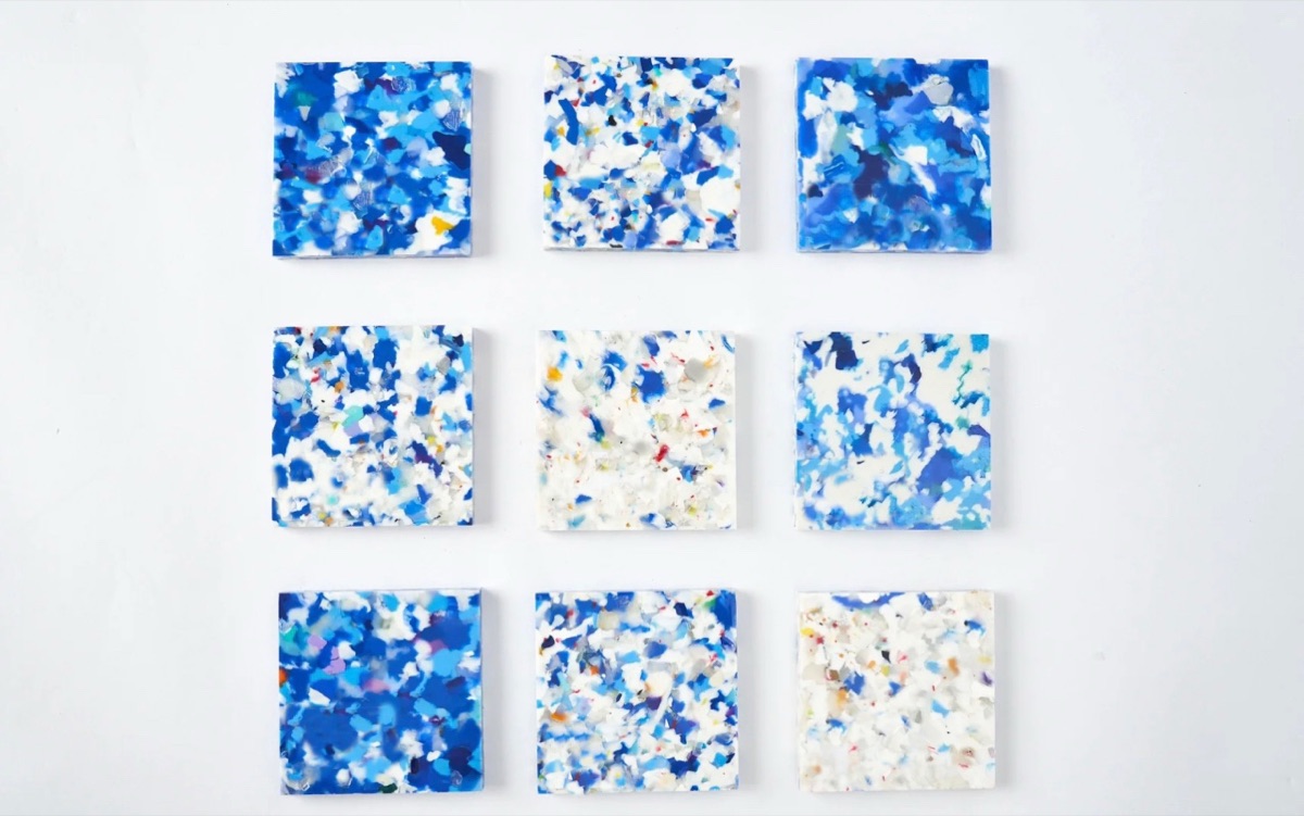
Flooring design references are useful when they explain a decision, not merely when they make an attractive presentation. A private-label team may gather a pale timber photograph, a close view of a textured surface and an image of a finished room. Those pictures can point in three different directions unless someone explains what each is meant to contribute.
A mood board is a small, organized set of references that communicates visual intent. It is not a production specification or a promise that every photographed detail can be reproduced. This guide shows how to give references clear roles, separate observation from preference and prepare focused questions for a development discussion. The method is editorial guidance for project teams, not a description of Benchwick's internal design procedure or an approval of any particular product.
Give flooring design references a single purpose
Begin with the decision the board should support. You might be narrowing a broad collection direction or explaining the character of one proposed surface. State that purpose at the top. A board intended to compare design directions needs different annotations from one intended to introduce a selected direction to a new participant.
Describe the intended audience and setting without inventing a product specification. For example, a team may want to discuss a quiet visual background for an interior concept. That is a design intention, not a verified claim about acoustic behavior, durability or suitability for a particular building.
Keep separate concepts on separate boards. Combining every attractive reference into one page can make incompatible preferences look like simultaneous requirements. If alternatives remain open, name them as alternatives and explain which decision will narrow the choice.
Assign a role to each reference
Label each image with the quality you want people to examine. Is it included for overall lightness, grain movement, contrast, surface relief or the relationship to other finishes? Choose a primary role. A reference may support more than one observation, but a reader should not have to guess which feature matters most.
Use plain descriptions rather than broad praise. A note such as softer contrast between the darker grain and the background tells a reviewer what to consider. Words such as premium or natural can mean different things to different participants and need visible examples or further explanation.
Record what should not be carried forward as well. You may value the grain direction in a room photograph while rejecting its warm lighting or plank proportions. An explicit exclusion helps keep incidental details from becoming unintended instructions.
Compare reference types without confusing their evidence
| Reference type | Useful discussion | Important limit |
|---|---|---|
| Material close-up | Grain detail and local contrast | May not show the full design composition |
| Full surface view | Distribution of visible features | Does not establish physical texture |
| Room photograph | Relationship to furniture and finishes | Lighting and perspective affect appearance |
| Physical reference | Direct visual and tactile discussion | Its identity and review conditions still matter |
| Technology illustration | Questions about a manufacturing approach | Does not confirm a proposed product's specification |
A board becomes easier to read when these categories remain visible. Do not give a technology illustration the same status as an approved project sample. Both may be helpful, but they answer different questions and carry different limitations.
Separate color direction from texture direction
Color, printed appearance and physical surface texture deserve their own notes. A photograph can show the apparent pattern of a surface while providing little reliable information about how it feels. A strong shadow in a close-up may emphasize relief that is less obvious in another view.
Benchwick's official innovation overview identifies Blue Eleven with digital printing and DSE with synchronized embossing. These are distinct technology subjects to discuss, not grounds for assuming that every proposed design uses the same construction or can achieve an identical result.
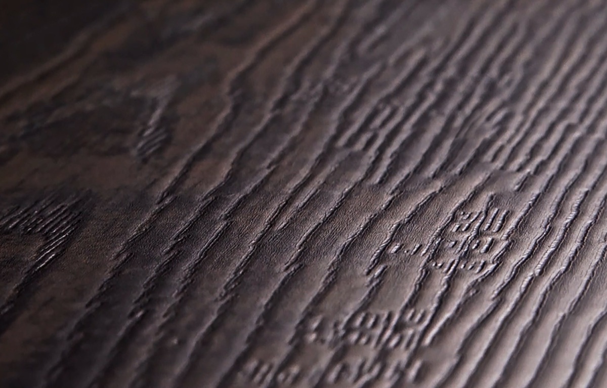
The official illustrations above provide context for that distinction. They are not a mood board for a specific customer program. Use the product overview to orient the conversation, then ask which product-specific information is needed for the proposed direction.
Keep screen-based color preferences provisional. A screenshot, compressed attachment or presentation export can alter what reviewers see. Record a preference in words and connect it to an identified reference instead of treating a display setting as an agreed physical color standard.
Preserve context when cropping or arranging images
A crop can help someone see a small feature, but it can also hide the surrounding pattern. When a detail is important, keep access to the full reference and label the crop as a detail view. Do not let a tightly cropped knot become the apparent scale or density of an entire design.
Explain whether images are shown at a meaningful physical scale or simply arranged to fit the page. Equal-sized rectangles on a slide do not mean equal-sized materials. If dimensions are unknown, say so; do not estimate a product measurement from an unscaled photograph.
Retain source information with the reference. Identify whether it came from an official product page, a team-owned image or another supplied source. Keep any unresolved permission or usage questions visible and use only material appropriate for the intended sharing context. The board itself does not establish permission to reproduce a design.
Turn preferences into focused development questions
After assembling the board, write the questions it leaves open. Separate a design preference from a manufacturing question. Wanting quieter grain is not the same as knowing how that preference will be expressed in a proposed product or how a result will be evaluated.
Ask about the specific feature rather than requesting a general yes or no. For example, identify whether the discussion concerns contrast, feature distribution or the relationship between visible grain and texture. Give the reviewer the relevant reference and the annotation, not an unexplained folder of images.
Mark questions that require product, design or other specialist input. Do not convert an encouraging conversation into a documented feasibility commitment. Record what was actually confirmed and what still needs a sample, a specification or a separate review.
Close the board with a clear decision boundary
At the end of a discussion, summarize the selected direction and the remaining alternatives. Name the version of the board covered by that decision. A later replacement image may change the meaning of the board even if its title stays the same, so make revisions visible to the next reviewer.
Useful flooring design references connect a visual preference to a source, a specific observation and a clear limitation. Start with the decision, give each image a role and keep color, texture and room context distinguishable. Then bring a concise board and its open questions to Benchwick's company contact page for a program-specific discussion. The next step is to clarify the proposed direction and required evidence, not to treat an attractive presentation as a finished product approval.
Frequently asked questions
What makes flooring design references useful?
+
Each reference should explain one design quality, show its source and state its limits. A note about grain character or tonal contrast is more useful than asking a team to reproduce an entire photograph without context.
Is a mood board a product specification?
+
No. It communicates a design direction. Product construction, dimensions, manufacturing feasibility, performance and acceptance criteria require separate verified information and appropriate review. Keep those unresolved questions outside the visual approval.
Can a room photograph establish an exact flooring color?
+
No. Lighting, camera processing, surrounding finishes and screen settings affect its appearance. Use a room photograph to discuss context, then use the appropriate physical references and agreed review conditions for project-specific color decisions.
How many references should a team include?
+
Use enough to explain the direction and its boundaries without creating contradictory instructions. There is no fixed universal count. Remove duplicates, identify the strongest examples and keep alternatives clearly separate from the preferred direction.